A Colorful Introduction
One of the most critical considerations when crafting picture books is the selection of colors. My goal is always to make my books cheerful, uplifting, and enticing. But have you ever paused to consider the profound influence colors exert on our emotions and decisions? Colors have the power to stir up strong feelings within us, be it love, disdain, or indifference. Think about it: Would you buy a car in a color you despise if it was slightly cheaper than the same model in a shade you adore? How much of a price difference would convince you to settle for the less favored hue?
Children’s perception of colors also adds another layer of complexity to the decision-making process. While it’s known that newborns initially see the world in grayscale, with red being the first color they discern, there’s a difference between seeing and feeling a color. Over time, through experimentation and reflection, I’ve settled on a design philosophy for my books that boasts bold, vibrant illustrations. The journey also required me to navigate the technicalities of printing – determining how dark a background can be while ensuring text remains legible. Thankfully, my bold choices have paid off, with the vivacious pages translating beautifully in print.
From Villains to Princesses: The Color Schemes that Define Them
To truly understand the influence of colors, I decided to conduct a little experiment using coloring pages. Drawing inspiration from the animated worlds we adore, rather than their live-action versions, a ‘princess color palette’ took shape in my mind, each hue resonating with distinct attributes:
Cinderella’s tranquil light blue radiates serenity and wisdom, reminiscent of the vast, peaceful sky.
Aurora and Ariel’s delicate pink embodies compassion, nurturing, and love, reflecting the boundless, caring heart of a mother.
Tiana and Mulan’s refreshing light green signifies growth, harmony, and rejuvenation, painting pictures of verdant landscapes and the promise of a new day.

Three adjacent squares showcasing the Princess Palette colors: a serene light blue, a nurturing soft pink, and a rejuvenating light green.
And the villains? They surely favor darker, more ominous hues. The sinister lineup of Ursula, Jafar, Evil Queen, Captain Hook, Maleficent, and Gaston conjures up three dominant colors: black, red, and purple.
For my experiment, ‘the villain color palette’ comprised these three shades.
Black, evocative of the night, symbolizes power, elegance, and mystery, but can also denote fear and the unknown, echoing the villainous natures.
Red, symbolizing intense emotions ranging from love to fury, mirrors the fierce temperaments of these antagonists.
Purple, a color often reserved for royalty, exudes luxury and authority. Its association with both regality and vanity aptly captures the essence of these adversaries.

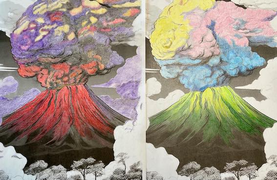
Putting Colors to the Test
How might a tranquil princess palette transform a menacing volcano? Conversely, would the intense villain hues render it even more forbidding? Using a grayscale image of the ‘Parícutin Volcano’ from my coloring book as a base, I embarked on this colorful journey. Do pastels turn the brooding smoke into soft, enticing clouds? Does the bold red invoke a sense of imminent danger? My attention, surprisingly, was consistently drawn to the refreshing green, an unexpected hero in this colorful narrative.
My Characters in Colors
Colors were chosen, but how did they fare in defining my characters’ personas?
Meet Phoebe, draped in hues of pink, purple, and white. The gentle pink infuses her with warmth and compassion, though it also makes her susceptible to feeling overwhelmed by emotions. The royal shade of purple amplifies her regal connections and lofty aspirations, but these dreams sometimes overshadow the needs of those around her. White, emblematic of purity and innocence, rounds off her character.
Contrastingly, Alexia is swathed in varying shades of blue. This color palette conveys trust, loyalty, and wisdom. The serene tones envelop Alexia, emphasizing her reliability. Yet, her unwavering loyalty occasionally renders her resistant to change. The depth of blue also underscores her intellectual prowess, which at times leads her to overanalyze situations.
While my color choices were primarily driven by personal preference, it’s intriguing to see how they could potentially shape our understanding of these characters. It’s worth noting: making Phoebe appear royal wasn’t my initial intent.
A Colorful Summary
Colors are pivotal in children’s literature, not just as aesthetic elements but as powerful narrative tools. They can evoke emotions, influence perceptions, and hint at character traits. As a storyteller, I’ve come to value the profound impact of colors, weaving them intricately into my tales. And yes, I do harbor a special affection for pink and purple!
In the end, every hue has a tale to tell. Which story will your palette narrate?


Leave a comment