Crafting the Layout: Merging Words and Art
Picture books have always held a special charm for me. A vital component of this charm lies in the harmonious combination of words and images. But creating that harmony? Well, it’s not always straightforward. Typically, children’s picture books follow certain lengths and formats. However, as with any form of art, there’s room for innovation. In my journey, I’ve realized the importance of understanding the structure before experimenting.
I often play with four types of pages in my books:
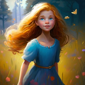
Pure Imagery: Here, I let the illustrations do all the talking. There’s something so profound about a full spread that captures the essence without uttering a single word.
Text-Only: These pages drive the narrative forward, often setting the stage for the subsequent illustrations.
Balanced Duo: A blend of image and text, neither overshadowing the other.
Dominant Imagery with Minimal Text: These are my favorite! The images take center stage, but a sprinkle of text adds just the right flavor.
I’ve noticed that the first two types, pure imagery and text-only, work wonderfully in pairs. The balance they offer allows me to create a rhythm that captivates young readers.
A subtle but essential aspect of my books is the font choice. I’ve always been inclined towards a handwriting look; it brings a personal touch. I sourced my fonts from Font Squirrel (https://www.fontsquirrel.com). While “SF Cartoonist Hand SC” has been my go-to, I recently experimented with “Komika Hand” for my work-in-progress. I’m contemplating if I should revert to my original choice; these decisions might seem minute but significantly impact the overall feel of the book.
Matching Word Count to Age: Finding the Balance
One of the intricate parts of crafting a children’s picture book is aligning the word count with the intended age group. While it might seem simple at first, diving deeper reveals the importance of finding the right balance.
In creating a children’s book, it’s essential to consider the recommended word counts for various reading levels. For Level 1 Reading Books, which are generally aimed at children aged 5 to 6 or those in Kindergarten to First Grade, the typical word count ranges between 32 and 150 words. These books usually have 2 to 3 lines per page, with each line not exceeding 30 characters. Moving to Level 2 Reading Books, designed for children aged 6 to 7 in First Grade, we are looking at a word count that falls in the range of 100 to 500 words. These books often have 2 to 5 lines per page, where each line is limited to 36 characters. Lastly, Level 3 Reading Books are crafted for children aged 7 to 8, or those in Second Grade. These books generally contain between 500 and 1,000 words and tend to feature 5 or more lines per page.
Delving into my personal journey, the word count in my own book series has seen an evolution. My first book contains 560 words, the second expands slightly to 750 words, and by the third book, I ventured into a richer narrative with 1,300 words. It’s noteworthy to mention that my third book’s word count includes notes about illustrations, which affects my planning process.
But beyond just word count, there’s the matter of the Lexile level, which assesses reading complexity. Regarding the third book, based on a rough estimate, its Lexile level hovers between 500L to 700L. This ideally suits early elementary students from 1st to 3rd grades. Though publishers have precise tools to gauge this, I rely on estimates to guide me. As I embark on my fourth book, ensuring the right language level and word count remains a priority.
A foundational belief of mine is that children deeply enjoy listening to stories while visually immersing themselves in accompanying images. This makes me wonder: does a higher word count, offering a richer narrative, enhance the experience for the young reader? Or, does it potentially complicate the storyline? I’m genuinely curious about your thoughts. Do you believe there’s a ‘sweet spot’ for word count, especially when considering the listener’s experience?
Maintaining Rhythmic Flow and Story Continuity
In the world of children’s literature, rhythm and repetition are foundational. They not only captivate young readers but also provide a sense of comfort and predictability. Each of my books begins by familiarizing readers with the central characters and laying out the story’s central premise. By the end, there’s a definitive closure to that particular tale, but also a hint at forthcoming adventures. This not only ensures continuity but also ignites a spark of anticipation for the next story.
I’ve consciously incorporated a repetitive theme across the series, where Alexia and Phoebe depart from their house and always make their way back after their escapade. While each adventure is distinct and standalone, these consistent elements string the stories together, fostering a sense of familiarity. I’m often reflective about my choices, and sometimes I ponder if this repetitive structure was the right approach. Yet, as I visualize the broader narrative arc, I feel this approach cohesively binds the series.
However, maintaining strict consistency has been challenging. Case in point: I opted for a change in Alexia’s appearance in the latest book. My reasoning was primarily technical. The narrative depth and complexity of the upcoming stories demanded a shift in the illustration style. The intricate designs I adopted for the initial books seemed less adaptable to the richer tales I’m now weaving. I’ll delve deeper into character evolution and my choices in a subsequent post.

Navigating the Color Conundrums in Book Printing
Color plays an integral role in book printing, and understanding the differences between RGB and CMYK is vital for aspiring self-publishers like myself. When creating digital designs, RGB is the default mode, but printed designs demand the CMYK palette. This seemingly small detail can significantly affect the final product.
In my journey, I’ve primarily worked with RGB. But while RGB provides a broad spectrum of colors for digital work, printing brings forth a different challenge. Platforms like Amazon automatically convert RGB to CMYK, which can sometimes alter the colors from what you initially envisioned. So, how can one anticipate what the printed book will truly look like? One tactic I’ve employed is printing a test page. This is a simple yet effective method to get a tangible feel for the color reproduction.
For the design aspects of my books, I rely on Gimp (https://www.gimp.org). Its primary strength lies in RGB-based image processing. Even though Gimp doesn’t natively support full CMYK editing, I’ve employed plugins to preview my designs in CMYK. This provides an approximation of how the final printed version might look. However, considering the uncertainties tied to automated color conversions, I’m contemplating exporting my third book directly in CMYK.
Interestingly, my publishing journey has been marked by adaptability. Initially, I had set out with an eBook-only mindset. But as time passed, the allure of tactile, printed books was too compelling to resist, leading me down this intricate path of color considerations and printing intricacies.
From Prototype to Print: Feedback and Finding Your Audience
Feedback is the cornerstone of creative refinement. While the initial reviews from those closest to us can sometimes blur the line between courtesy and candor, their observations have often led me to revise, especially in the world of illustrations. We must remember that continual refinement is intrinsic to the art of storytelling.
Reflecting on my journey, I often wonder how other writers gauge reactions to their stories. Do they conduct reading sessions with children? Are there any specific criticisms that reshape their narratives?
For me, feedback has been predominantly from my inner circle, and it’s always a challenge discerning if their praises stem from genuine admiration or mere politeness. I’ve iterated my work significantly since its inception. In fact, the current versions of my books are far from their original editions. I’ve revamped illustrations, and only a select few have glimpsed the very first draft of my debut.
The realm of self-publishing is both a boon and a bane. The freedom it offers is unparalleled, but it demands a mastery of various roles—from crafting an impactful cover to understanding the intricacies of platforms for maximum visibility. Yet, in this overwhelming world of self-publishing, where half the advice leans towards hiring professionals and the other half promotes DIY approaches, one thing remains clear: gaining traction, especially on colossal platforms like Amazon, is an uphill battle. But with resilience and adaptability, it’s a hill worth climbing. The challenge is less about “if” and more about “when” your book will capture the attention it deserves. I hope.


Leave a comment