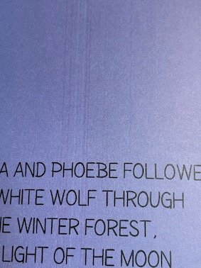
One of the happiest moments for any author is witnessing their work come to life in print. This joyous occasion came for me with the delivery of my Amazon order. Brimming with excitement, I unboxed several copies of my books. However, as I eagerly flipped through the pages, a startling detail caught my attention. Unexpectedly, one of the books was marred by stripes on nearly every page.
Initially, I was quite devastated, even bordering on melodramatic. The unexpected stripes were disheartening, yet, aside from this flaw, the print quality appeared satisfactory. A few days later, a curious development occurred: I noticed that another parcel from Amazon was on its way. This left me puzzled and hopeful. Could it be that Amazon had noticed the printing error? Was I about to receive a replacement for the flawed book?
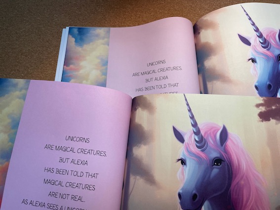
The moment the unexpected shipment arrived, I eagerly uncovered its contents to find new prints of the books I had ordered. At first glance, they seemed indistinguishable from the originals (apart from the one with the stripes). However, a closer look revealed a subtle yet significant difference in shading. I must confess, the color discrepancies had initially escaped my notice, if we set aside the more obvious striped issue.
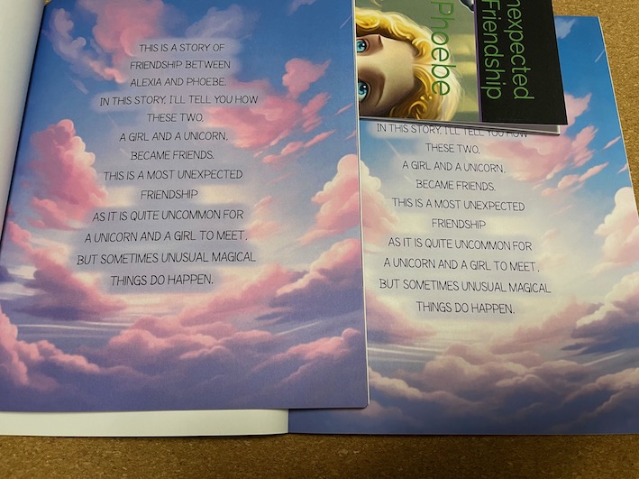
This revelation led me to a more detailed comparison of the prints. For example, on examining the pink pages side by side, the contrast was striking. The bright, vivid pink of one stood in clear contrast to the pale, almost faded appearance of the other. It wasn’t just a difference in color but also in the overall visual effect. Similarly, inspecting the images with the colorful cloud backgrounds highlighted the importance of contrast in ‘Alexia and Phoebe.’ One print showcased a rich, dynamic range from pink to violet, while the other lacked this vibrancy, making the clouds seem dull and lifeless.
In reflecting on the situation, I acknowledge the inherent differences between digital and print formats. The vibrant RGB colors displayed on my screen inevitably shift when translated into the CMYK color space of printed materials. This conversion, which I entrusted to Amazon, always carries a certain risk. My oversight, in this case, was not immediately comparing the new prints with the ‘first edition’ copies I already had. These original prints could have served as a benchmark to spot the discrepancies earlier. When the books first arrived, my attention was so captivated by the stripe pattern that I overlooked the subtler issue of the overall brightness. This distraction was significant, as it effectively meant I was short one usable book from the batch.
Life, however, always has its surprises. The unexpected delivery, to my delight, contained reprints of all the books. This meant I now had an extra copy of the gratitude journal – a pleasant coincidence, considering I hadn’t planned on ordering another for myself. This entire experience underscored the sense of care and quality control that Amazon extends to its authors, rectifying printing issues even before they are raised. Their proactive approach added a layer of reassurance in the publishing process. And speaking of gratitude, this brings to mind the renowned ‘happiness course’ from Yale that I took at the start of the pandemic. While I have no direct link to this course, its unique and insightful approach was a breath of fresh air during those uncertain times, and it left a lasting impression on me.
As the calendar turns and December approaches, I can’t help but feel a sense of excitement for what’s ahead. While I can’t reveal all the details just yet, keep an eye on this space for some fun and engaging surprises that I’m currently brewing up. Think of it as a little extra color and joy to brighten up your Sundays as we journey through the festive season together. Stay tuned!


Leave a comment