Introduction to the Project
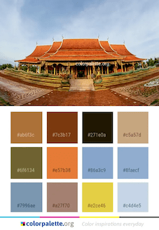
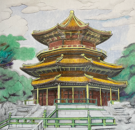
Exploring unfamiliar destinations through art always brings a unique thrill. My latest project involved bringing the grandeur of China’s Forbidden City to life on paper. Initially, I was inclined to use a classic combination of bright red and black. However, after some research, I stumbled upon a fascinating alternative: a ready-made color palette specifically designed for Chinese historical landmarks.
Color Matching and Selection
Transitioning from hex codes to tangible colors presented its challenges, as these digital shades didn’t directly match my coloring pencil set. Nonetheless, I set out to match the colors to my liking, emphasizing the deep, warm browns essential to this project. The colors I chose included PC946 Dark Brown (#ab6f3c), PC947 Dark Umber (#7c3b17), PC948 Sepia (#271e0a), PC1082 Chocolate (#c5a57d), and PC941 Light Umber (#6f6134), sometimes blended with PC 914 Cream for lighter effects.
I found myself particularly drawn to Chocolate for its depth and Sepia for the darker sections, the latter being a very dark brown with an inviting warmth. The other browns were used more sparingly. As I immersed myself in the coloring process, I realized that I had become so captivated by the work that my notes were left incomplete. It’s remarkable how easy it is to lose oneself in such a creative endeavor!
A key color for the ceilings was PC1003 Spanish Orange (#e57b38), a bright and warm orange. I added just a touch of PC1082 Chocolate to subtly darken the shade. Interestingly, while I’m not a fan of yellow, this shade of orange has become a favorite.
For the main walls, I opted for PC1081 Chestnut (#a27f70), a warm, muted brown with a hint of red undertone. Despite my initial hesitation and the temptation to use a brighter red like Scarlet Lake or Crimson Red, I remained committed to my original plan.
Next, I tackled the gilded structures of the temple with PC1004 Yellow Chartreuse (#e2ce46), a vibrant color with a greenish tinge, perfect for complementing the turquoise railings. It was a departure from the typical Metallic Gold or Goldenrod, but it aligned well with the overall scheme.
The sky presented another artistic decision – opting for muted blues, or blues with a hint of gray. For this, I used PC1024 Blue Slate (#86a3c9) and PC1023 Cloud Blue (#8faecf & #c4d4e5). To create the turquoise for the railings, I employed PC1022 Mediterranean Blue (#7996ae).
As a final experiment, I tested the brightness of the colored pencils against wax crayons by coloring the background with the latter. To my surprise, the pencils matched the brightness of the crayons but offered much greater precision.
Conclusion and Visual Showcase
As we wrap up this journey through colors and history, I can’t help but wonder about the endless possibilities out there. What historical landmarks would you like to bring to life with your colors? Share your thoughts in the comments; I’m always looking for new inspirations!
Below, you’ll find the final image of my Forbidden City project alongside the inspiration image that started it all. Seeing them side by side, it’s fascinating to observe how the inspiration translates into the medium of coloring.
I look forward to hearing your ideas and seeing your own colorful explorations of history!


Leave a comment