Last time, I wrote about the marketing campaign on Amazon—you can read it here if you’re interested. In addition to the advertising campaign for these two books, I conducted a third test in a different arena. I created an additional test on YouTube using my latest video as the test material. As I write this blog post, I’m starting to regret my choice.
The Instructions and the Problem
If you’ve ever considered doing YouTube, you’ve likely encountered a sea of videos claiming that the most important elements are the title and the thumbnail. These should be complementary and spark curiosity. The third crucial element is that the actual content should obviously match the two. Otherwise, you end up with annoyed viewers on your channel, which is not good as they have access to the dreaded ‘dislike’ button.
This time I decided to use the click rate as my metric—you know, the percentage of people who see the video thumbnail and actually click on it. This is a metric that you can easily obtain. So, the goal is to achieve a higher click rate compared to other videos in the same playlist. Clear setting, do you agree? There is one caveat, though; my videos receive very different numbers of impressions. This might impact the click rate, as the number of impressions typically causes the click rate to decrease—it seems the video is tested with some viewer pool.
How I Addressed This
Now, I have a plan and a metric to follow. The main problem remains; how do you spark curiosity with a coloring video?
Let’s start with the title. What would you think about: “The Shocking Secret in Coloring!” or “What No One Has Ever Told You About Coloring!”? My favorite is “I Will Spill the Most Guarded Secret in Coloring.” Most videos that are titled in this way share the shocking information that you must use light layers and blend colors to get the desired look. Shocking indeed. I think I could do this, but it’s a bit deceptive—the instruction is true, don’t get me wrong, but it’s the most common instruction I’ve seen for coloring. It’s well-known.
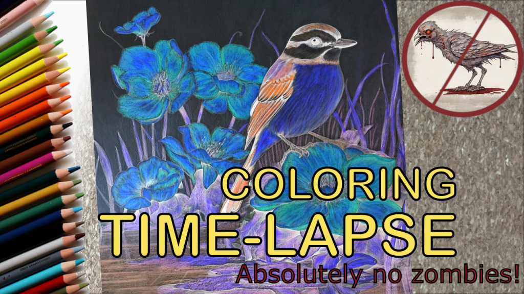
The coloring project at the time I came up with this idea was “color inversion,” and I was creating the reference images with a computer. One of the images created looked like a zombie. And this was the idea that stuck. The title became: “Birds and Blooms Series: Coloring a Zombie Bird and Fluorescent Flowers.”
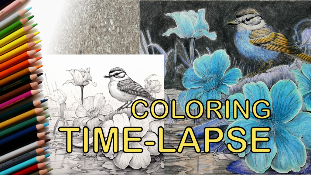
Next, it was time to plan the thumbnail. First, let’s show the template version of this cover:
As for the “spark the curiosity” cover, I needed to make the bird look like a zombie, which was easy as I had the image. But somehow, I needed to indicate that there are no zombies in this video. Why would there be? This is a coloring time-lapse video. But this was the idea I hoped would cause curiosity. I made changes, and here it is:
I uploaded the “curiosity cover” and title to match it and launched the video. My initial idea was to follow the progress of the video for about 14 days, until it was time to publish the next video from this “Birds and Blooms” series.
Did it Work?
It was the longest day so far to see how this video was received by viewers. To have something to compare the performance with, the average click rate for videos on this playlist is around 2.5%. This playlist matches the theme of the video, and the image is part of this series.
For the first three days, the click rate hovered around 2%, with some variation between days, but it was declining. Perhaps more days would have given me more reliable data, but I ran out of nerves and reverted the thumbnail and title to the template version. After this, the video started performing normally compared to my other videos.
What to Think of This One?
In conclusion, this experiment highlights the delicate balance between creativity and viewer expectations in YouTube content. While the “zombie bird” concept initially seemed promising, its performance suggests that viewers might prefer straightforwardness over sensationalism, especially in educational or instructional content like coloring. Switching back to a more traditional presentation not only stabilized my video’s performance but also taught me an important lesson: engaging viewers effectively often means providing clear and dependable content rather than relying on shock value. In the future, I plan to focus on combining creativity with clarity to make sure my videos are both interesting and educational.


Leave a reply to Reflecting on a Year of Creativity: What’s Next for My Artistic Journey? – Artistic Adventures with Victoria Cancel reply